#308
HUNGRY BEAST
21 Feb 2018 By David Fuhrmann-Lim
Design We Love: Juicy Branding For Hungry Beast by Savvy Studio.
By Marta Knas
Hungry Beast is a company created from the need to create a café and a place where health meets casual.
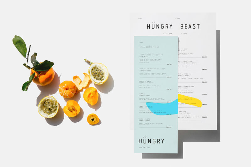
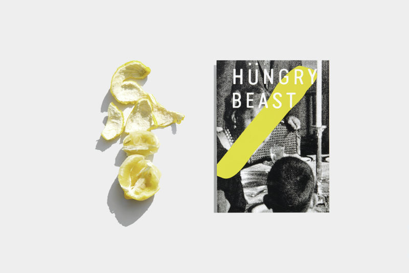
Highlighting the simplicity in providing quality, healthy products, the visual identity conceived by Savvy Studio was inspired by John Baldessari’s ‘Connecting Dots’.
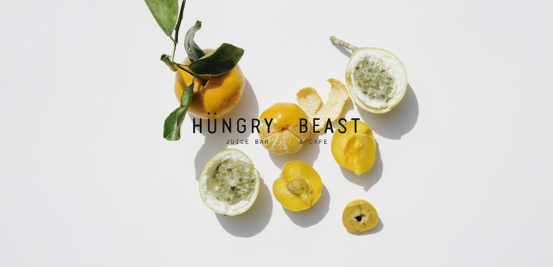
Marrying simplicity with stark colours, the branding appears fresh and allows the ingredients to stand out.
[ 7 Hot Hotel Bars You Oughta Visit ]
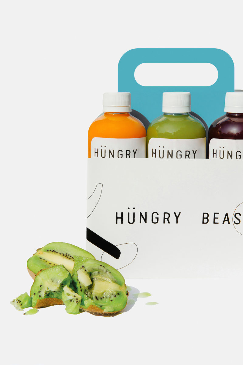
“The visual applications such as the boxes and the take-away bags were kept with the name of the restaurant standing out as the main element.”
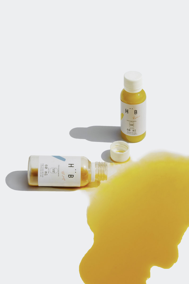
“Adding haphazardly throughout the various elements, from the cups, to the boxes, to the napkins and to the tote bag.”
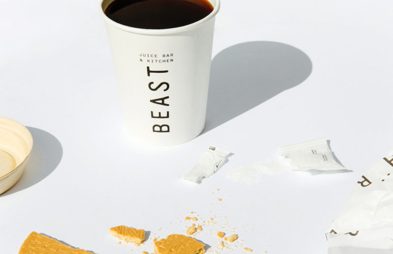
“The elements add a feeling of fun and light-heartedness to the brand. It is about taking health-food not too seriously.”
Read it at Trendland
Like this? We’re suckers For Cool Design – Especially This!

You might be interested in...
[CLOSED FOR GOOD] DRINK (EAT) HERE: LOW TIDE
[CLOSED FOR GOOD] For a Tropical Bar, The Food Here is Rather Universal. For an Unassuming Restaurant, The Rum Cocktails Are Pretty Killer.
VISIT AUDITORIO NACIONAL
Mexican Studio Esrawe Has Completed Its Stunning Work On Bar Auditorio Nacional.
MUSIC & ART
Ken Fulk Designed the Gorgeous Legacy Records Restaurant & Cocktail Bar in NYC.
[CLOSED FOR GOOD] DRINK (EAT) HERE: LOW TIDE
VISIT AUDITORIO NACIONAL
MUSIC & ART