
#439
THAT '70S SHOW
23 May 2018 By David Fuhrmann-Lim
A Range of Influences, From 1970s Italian Design to Art Deco Details, Informed Designer Camilla Deterre’s Interiors For Primo’s Bar and Lounge in Tribeca.
From Dezeen
Primo’s opened in May 2018 at 129 Chambers Street in the Lower Manhattan neighbourhood, as a spot for cocktails and light bites. The concept for the space was created by Aisa Shelley, who wanted to mix the “leisure of beachside service with the welcoming sanctuary of an established neighbourhood staple”.
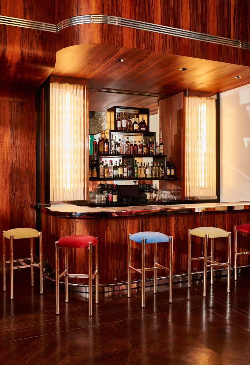
“Primo’s draws the inspiration for its comfort and refreshments from the mid-century resorts of the Italian Riviera and the jocular Long Island social clubs of yesteryear,” said a statement from the Primo’s team.
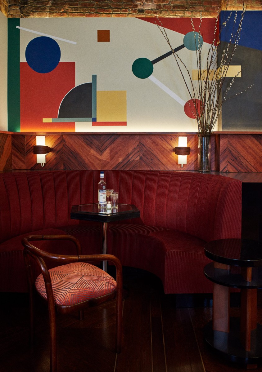
Deterre interpreted this idea for the decor, combining references spanning from the mid-century Italian designs of Carlo Scarpa and Ettore Sottsass, to the art deco aesthetic associated with 1920s and 30s New York.
The space is laid out in an L shape, so visitors first arrive into a lounge area populated with low sofas and comfy armchairs, beside bookshelves and artwork covering one wall.
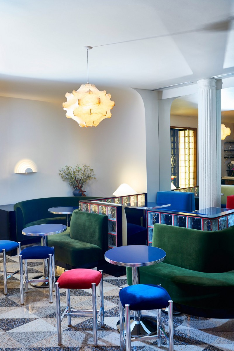
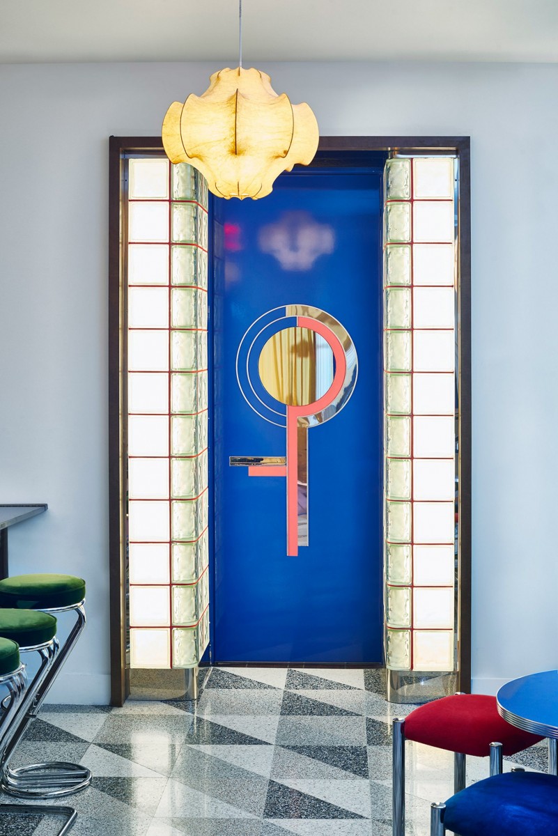
To the right is the first bar area – a bright room with custom terrazzo flooring and vintage Cocoon lights by Achille Castiglioni.
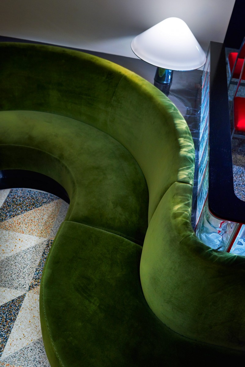
Booths are created by low partitions formed from glass blocks, with seating upholstered in deep blue, green and red velvet. Tables are topped with glossy coloured laminate, and metal stools have seats covered to match the built-in benches.
[ From A to Z, 26 Useful Words to Know From The Booze Biz ]
The final space is reached through a bright blue door, surrounded by more glass blocks and marked with a mirrored motif.
A completely different atmosphere is achieved in the second bar, which is lined in dark wood panelling that wraps around the counter and portion of the ceiling above.
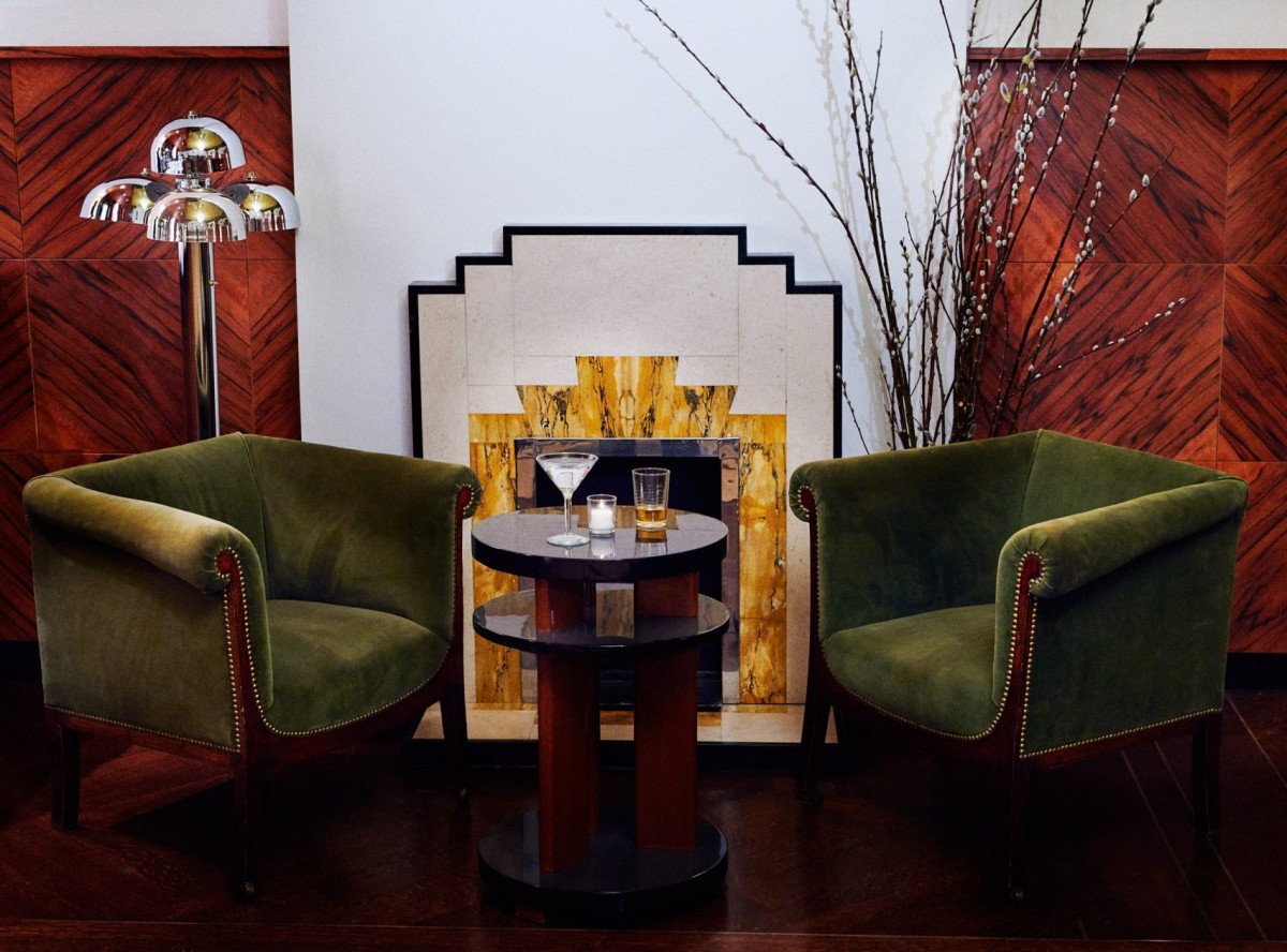
An abstract mural by Connie Vallese features primary hues and a combination of geometric shapes, and runs across the back wall above claret-coloured booths. The painting complements a large art deco mirror that hangs on an adjacent wall, facing a large chandelier with brass branches and globe-shaped diffusers.
A variety of casual seating options and a marble fireplace add to the relaxed ambience.
Graphics and branding for the bar were designed by Jonathan Cammisa, while custom uniforms for the staff were created by Greg Armas of Assembly NYC.
Other recent additions to the city’s ever-evolving drinking and dining scene include Patent in NoMad – which operates as cafe by day and speakeasy by night – and Don Angie in the West Village, designed as a cross between a traditional Italian trattoria and a New Jersey red-sauce joint.
Photography is by Adrian Mesko. Read it at Dezeen.
Like this? Patent is a cafe by day, and a speakeasy-style bar by night
Like this? Learn the secret lingo of bartenders

You might be interested in...
DRINK HERE: BAR CICHETI
The Recent Refresh Works a Treat: Our Favourite Italian Pasta And Wine Bar Has a Revamped Menu, Refigured Space And Reworked Branding That's Just Favoloso.
DRINK HERE: MILANO PIZZA & WINE
[CLOSED FOR GOOD] Eat Here as Well: The Zas From Anthony "Pizza Czar" Falco Are Damn Persuasive, But Definitely Pour Down Some Cocktails From the Bar.
WHAT'S UP DOC
The Future of Prosecco is Looking Rosier Than Ever With The Introduction of Its New Rosé Category
DRINK HERE: BAR CICHETI
DRINK HERE: MILANO PIZZA & WINE
WHAT'S UP DOC